The first time I’ve enjoyed the adaptation more than the book. Although the book is great, the film was just such a spot-on-and-beyond follower that reading the book after seeing the film diminishes my liking of the book.
Monthly Archives: October 2014
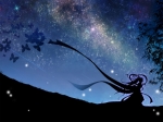
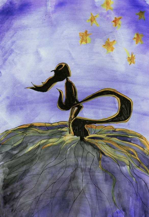
Inspirational images, starry sky.
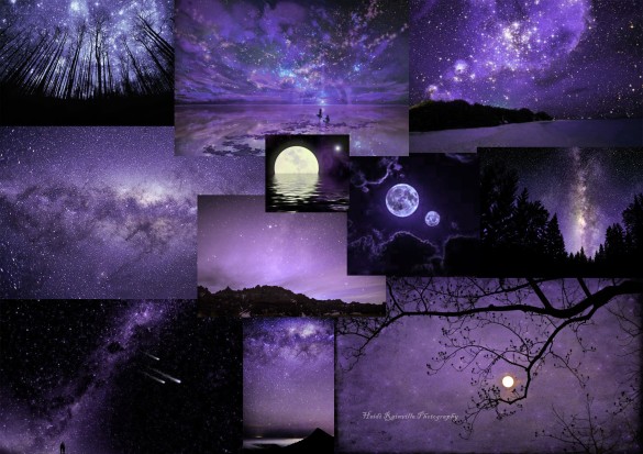
Moodboards and color contrast.
After experimenting with my concept drawings, and settling with a color palette I quite liked, I decided to put together some moodboards. The palette I had in mind was a subtle violet, with a strong contrast between light and dark values.
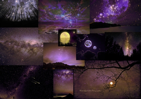
As I was creating these boards, I realized that no matter how much contrast there is between light and dark shades, a palette without color contrast will naturally appear monotone.
I tried adding yellow to the purple, but this reminded me of too many films I’ve already seen. Tangled (2010) especially.
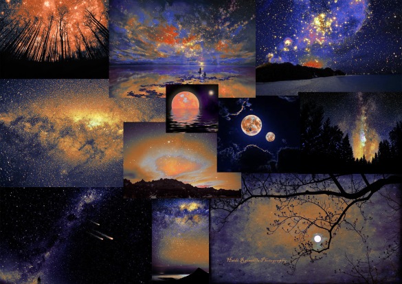
However, when I went back to the original contrast I’d had in my concepts, it looked really nice! The colors on these boards are a tad too vibrant and strong, but I think the extreme makes a good impression. I can tone it down now instead of trying to enhance it.
I feel like I’m often trying to make things too naturalistic. A purple and yellow colour contrast is more comfortable because it seems more similar to natural occurrences. But I want to challenge myself to work with something outside my comfort zone. I really like the contrast between blue and orange, and I like that it sends out a more surreal essence.
Story thumbnails, Starry Night
Article notes: Frozen in Time
Frozen in time: when will Disney´s heroines reflect real body shapes? by Anna Smith, 2013.
Both Elsa and Anna have the kind of proportions that would make Barbie look chunky: tiny nipped-in waists, no hips, long legs, skinny arms, perfect breasts, small feet and eyes three times the size of the male characters (par. 2)
I agree on the chunky Barbie comment, but I have to say that there is a vital difference between Barbie and the Frozen´s protagonists: Barbie, although unrealisticly proportioned, looks realistic. Elsa and Anna look like caricatures. Although I agree that Frozen´s characters promote an unrealistic body image, I think Barbie did the same at a much more severe scale, exactly because the rest of her design is realistic. I think the massive eyes indicate the fictional existence of the characters, while also functioning as tools for optimal expression, which again makes the characters seem real. It´s a tricky one.
To use these big doe eyes as standard in supposedly realistic human females reduces the characters´individuality and sends out a message: to be a princess, you must not only be brave but have a specific, unattainable brand of beauty (…) No deviation from the formula is permitted. From Sleeping Beauty´s Aurora to Aladdin´s Jasmine, you´ll see a similar look in Disney princesses´past (par. 2)
To some extent I really, truly agree: using the same body type to promote characters could potentially, and will most likely, lay a foundation for a limited beauty ideal in children. But I also believe that everyone perceives things differently, and there´s no controlling how children interpret the information handed to them through the media. I do think that it would be more responsible of larger companies to show a variety of body shapes as idols, but at the same time you can´t blame a company, large or small, for wanting their characters to be recognizable. Frozen´s heroines continue the look passed on to them from the innitial Disney heroines. If you look at DreamWorks heroines, they have a slightly different look. I find it completely irresponsible for someone producing children´s films to not consider the influence their characters have on children´s body image, and I don´t understand why this issue is being ignored by Disney, but I also think that the problem could be easily resolved by parents showing their children different films. There are more family film producers than Disney, and it´s their right to brand their characters. Also, by showing your children films from a variety of companies this is likely to lower Disney´s influence on newer generations. The tricky thing is, that Disney has amazing storytelling skills. But, so do many companies.
On the other hand, I do understand why people are reacting so strongly to Frozen´s character designs. Previous heroines and princesses have had similar body types, while the newer ones from Tangled and Frozen seems to be of an identical mesh, with the exception of a slight height difference between Elsa and Anna. I suppose this is to save time on building and programming new characters. But I don´t see how it´s not destructive, storywise. With the exception of Shrek and Lilo & Stitch, I´ve never seen animations with such strong character personalities as Frozen. Why would they not want to show this through character designs?
Story concepts
Book: The Help
I like the writing style: how not only certain events but also a crucial “waiting” period in American 1960’s history is explored from three different viewpoints. I wasn’t too fond of the ending, but it didn’t match Abeline’s simple-life charismatics: Today’s a new day, as easy as that.
TED talk: The Clue to a Great Story by Andrew Stanton
What would I do without TED talks? This lecture was held by Andrew Stanton at California Art Institute in 2012.
Storytelling is joke-telling. Know your punch line. You have to make your audience care. A story should open with a promise that following it to the end will be worth your viewer´s time.
2+2: the Unifying theory:
Give your audience clues that they can add together themselves. Make them anticipate the answer.
Your character will strive to be good at the one thing that makes his or her life worth living. You want to evoke wonder, find the magic ingredient that does thing.
Drama is anticipation mixed with uncertainty. Include honest contrasts or obstacles.


