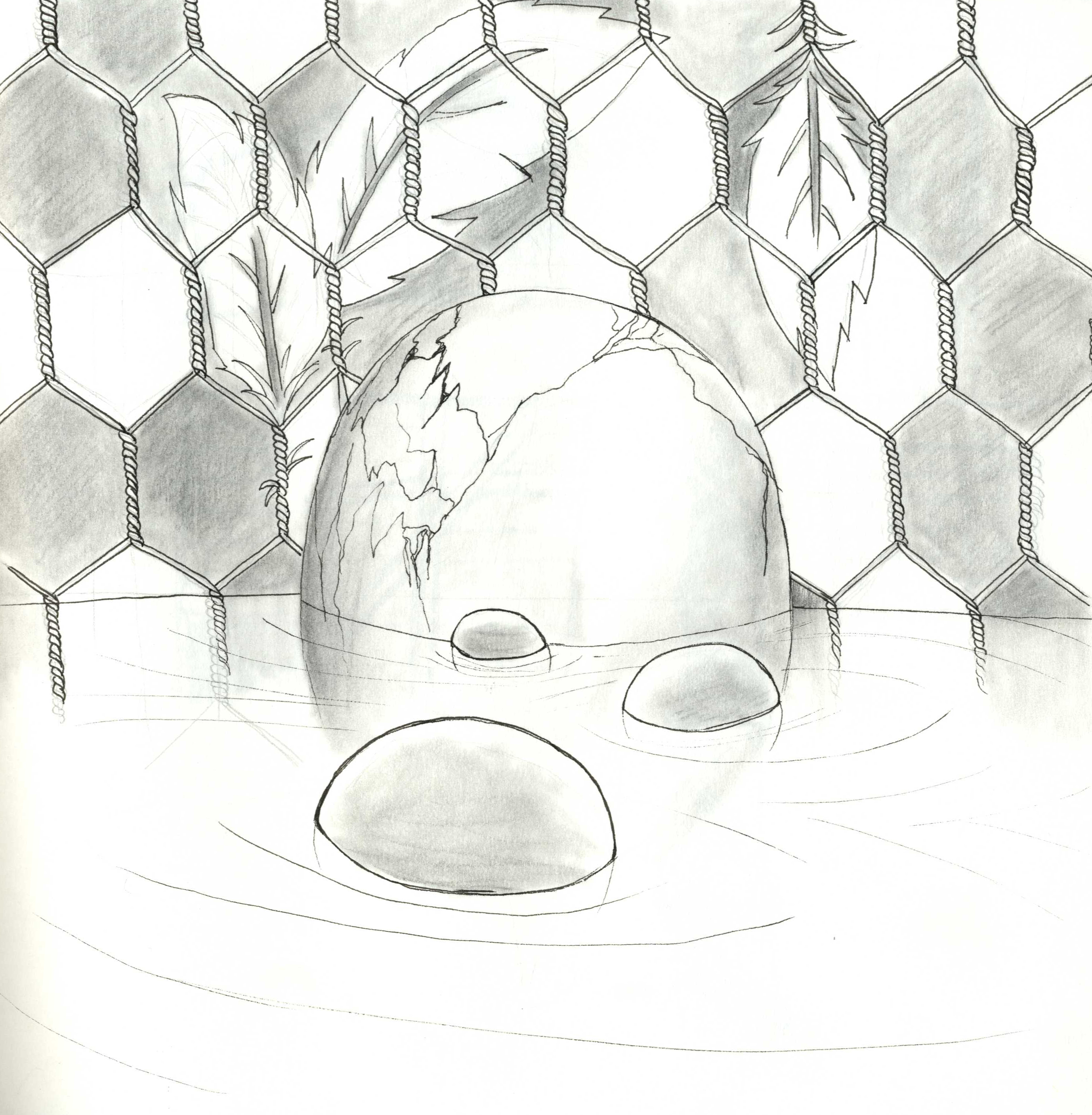
I saw the cutest short film in the history of my cinematic memory. It’s called The Dam Keeper. I made a sketch inspired by it, but didn’t have time to finish it. Might as well leave it like it is.

I saw the cutest short film in the history of my cinematic memory. It’s called The Dam Keeper. I made a sketch inspired by it, but didn’t have time to finish it. Might as well leave it like it is.
Tonko House is a start-up animation studio founded by Dice Tsusumi and Robert Kondo. Both previously worked at Pixar, and found that they worked well together. Their first short film, The Dam Keeper, was nominated as the best animated short for both the Annie Awards and the Academy Awards 2015, as well as pulling in nominations from Long Beach Indie, California (won), New York International Children’s Film Festival (won), Berlin International Film Festival (nominated), and San Francisco International Film Festival (won).
I’ve been stuck to Youtube for the last few hours, stalking their channel like a crazy person. I’ve also signed onto a notification list for when their next online class with Schoolism will be open for sign-ups.
Schoolism course:
What’s cool about Tonko House’s channel is that they post timelapse videos of the founders of the company working. It’s such an amazing experience to be able to be a fly on the wall, watching accomplished artists at work.
Robert Kondo painting demonstration:
Dice Tsusumi had a lot of wonderful digital painting demos, but I can’t help re-watching this one where he paints Pig with watercolours. It shows an extraordinary link between digital painting and physical, if that’s the right term, painting.
I found this video really interesting! It’s like bringing a canvas out to paint live models, except you bring your laptop and pen tablet! Thought I was the only weirdo doing that, haha.
Was that the thought that went into their head when coming up with this movie? I don’t really care, I am exited! I just watched the trailer for Sony’s upcoming feature, Pixels (2015, dir. Chris Columbus). Long story short: aliens misenterpret video game signals as a signal for war, and attack earth through retro video games such as Donkey Kong and Pac-Man. I was curious, in regards to the VFX style and the film’s concept, of just how serious the film would be. Then I saw Kevin James, Peter Dinklage and Adam Sandler were in it, which said it all: it shall be brilliant, -but serious? It doesn’t really matter.
Something that I’ve been struggling a lot with for this project, is the island in which my whole story takes place on/around. This is an issue, as the island is vital to the story. My problem is: what shape should it be?
I originally wanted it to appear fairly plain from a distance. Then I decided that that seemed boring, and would likely not communicate the island’s sinister and dead reputation.


I remembered reading Arnold Aronsen’s American Set Design book a few years back. This book features a visual library of different theatre designs, with the designers’ notes in addition. Something from this book has stuck with me since reading it: one of the designers specified that he would always work out his plan first. Then, and only then, could he achieve a functional and appealing design.
Since I’m more of a technical than a creative person, I was really fond of this idea. I think I’m one of those people who has to see the lines before I can draw outside of them. Anyways, yesterday I returned to one of my island visuals which I haven’t worked on for a while, but as I saw it, I realized how very, brutally bad the design was. It looked okay as an illustration, plus the hours and hours I’d spent perfecting it were difficult to discard from this moment of truth, but eventually I had to admit to my island’s current, dysfunctional design.
I sat down at home trying to figure out the plan. One thing I decided early on was to have the island round, so that it would look like an eyeball. I imagined the sand around it or the levels under the water surface could be the eyelids. I also had this ‘grand’ idea of having the island appear plain, until the moon rose to a position that would visually look like it was the pupil and the island was the eye. I still wanted these elements, but they were proving trickier to get.
One more thing I was struggling with, was working with a big-scale location. Since all my other locations exist inside of this island, its plan has to allow for the characters’ paths. I asked myself: what are the most important aspects of the island’s plan? Answers:
Ideally I’d want the observatory to be on a beach as well, as I want the effect of the moon shining through it’s cracks to create spotlights on the water. I also want it to be the tallest point of the island: it would make sense to build an observatory on the tallest point of the island. But this collides with how I want The Lonely Monster to have build a massive shield of branches which covers the entire island, as the tip of the shield would then be the tallest point.
I sought help from one of my flatmates, who’s currently in Theatre Design. She started telling me about ‘her rock in Greece’ as she called it: a rock that her and her siblings would swim back and forth to from the beach. I was fascinated by this, and realized that I had not considered the possibility of rocks around the island. Except pebbles, but those generally don’t stretch very high. I was even more fascinated when she drew it up for me, and it looked like a tall, constructed pillar sticking out of the water, far away from other land. I looked into some images of Greek island, particularly Patmos, which is the one with my friend’s rock:


We started talking about how I could show the island. This conversation was mind-opening, and totally jump-started my inspiration and motivation back on track. We drew some collaborative sketches working out what it could look like. We came up with the following:
For technical drawings, I’m referring to the visual development process of Tangled (2010, dir. Nathan Greno & Byron Howard). Maybe this will help me in comprehending the larger location.


New moodboard for island:


I found Whiplash to be a very inspiring film. Musical films always tend to inspire me. This one reminded me a lot of Raise Your Voice, but in a less teen flick manner. Although I do love watching teen flicks, this story was better fitted to the realistic way it was created.
I found the level of motivation in the protagonist highly admirable. The acting was brilliant, fantastic, brutal, believable. There was no ´too much´nor ´too little´. Everything was there. I loved that there were no overdramatized moments, it made the performances honest and realisic.
I´m not sure about the production design. It was very believable in the sense that it blended in with the realism of the story and setting. I suppose it wasn´t meant to pop out. I know people say production design is supposed to be unnoticable, but I think that´s dumb. If it´s supposed to go unnoticed, than whhhy bother? The reason why I like it is because I remember good designs, amazing designs, and dreadful designs. I think there´s a limit to how unnoticeable one should make a design. But I´m not experienced enough to determine where this limit goes.
I went to the BFI´s preview of Big Hero 6, with the directors of the film introducing it. I have to admit, it was strange seeing a Disney film with human charactersand no love story. I like the direction Disney seems to be heading: 2013´s Frozen tacles a sister relationship, while Big Hero 6 tacles a brother relationship. I love that the film didn´t have a purely evil character. It´s not a tale of good versus evil, but a revenge story.
There were three parts I particularily enjoyed about the film:
I´m not sure how I feel about the Production Design. I really liked the personal and intimate levels of design, and I think they functioned very well. I found that although the representation of the universe and existence of San Fransokyo was communicated very well, but I didn´t like the look of it. I suppose it would make sense if I had ever actually been to either San Fransisco or Tokyo, but since I haven´t I wasn´t able to establish a fondness for the design. It did work, however. As for the world level, I thought it was brilliant. It was very clear that the world was futuristic, that robots were a completely normal part of everyday life, while the rest of society was pretty similar to today´s life. I´m probably mixing the universe and the world a bit, and the world with the local, but I think that´s good: they´re supposed to blend together, right?

I can´t make up my mind about Boyhood. The fact that it was filmed over a twelve year period is a marvel in itself, but it doesn´t cover up the storyline´s lack of anticipation. In a way, Boyhood was like life: lots of things happened, but not to the dramatic extent that we´re used to see in the cinema. I kept waiting for something extreme to happen. Although many things happened, they were always expected.
One thing I really liked was that the protagonist was into photography. What a clever symbol: his passion is to capture moments in time, whereas the movie itself states how time cannot be frozen. And: although his life has been filled with moments he´d like to forget, he lives to capture the strangeness and beauty in everyday life.
The constant moving was clever: that way they didn´t have to keep locations intact.
Fight Club is one of the few adaptations I´ve seen that turned out to be better than the book. The house on Paper Street looks amazing. It communicated the book´s atmosphere to the dot, and looks visually spectacular.
For some reason this came out of a sketching session while watching Nightcrawler (2014).