Observatory design thoughts…

I was painting the interior design of my Mayan observatory the other day. I had the old layout design up as reference, and Charlotte told me it reminded her of Disney’s Atlantis. This made me very happy, for two very different reasons:

  1. Atlantis was also based on the architectural style of ancient Mayan civilization.
  2. This style has already been done in animation, many times I’m guessing. This is why I stepped away from this design: I didn’t want to create something strictly period based.

So yes, her comment gave me a good moodboost 🙂

observatory inside

12 principles of animation

Today I was checking out this new creative networking site called Hiive. Someone posted a list of videos explaining the 12 principles of animation. I remember reading about these in Ollie Johnston and Frank Thomas’ book, The Illusion of Life, and in Walt Stanchfield’s 20 Years of Disney Masterclasses, collected by Don Hahn, but I couldn’t really recall each of them.

These videos turned out to be ideal for a re-cap! The third one, staging, in particular, as it applies especially to production design.

Easter re-charge with Tonko House

Tonko House is a start-up animation studio founded by Dice Tsusumi and Robert Kondo. Both previously worked at Pixar, and found that they worked well together. Their first short film, The Dam Keeper, was nominated as the best animated short for both the Annie Awards and the Academy Awards 2015, as well as pulling in nominations from Long Beach Indie, California (won), New York International Children’s Film Festival (won), Berlin International Film Festival (nominated), and San Francisco International Film Festival (won).

I’ve been stuck to Youtube for the last few hours, stalking their channel like a crazy person. I’ve also signed onto a notification list for when their next online class with Schoolism will be open for sign-ups.

Schoolism course:

What’s cool about Tonko House’s channel is that they post timelapse videos of the founders of the company working. It’s such an amazing experience to be able to be a fly on the wall, watching accomplished artists at work.

Robert Kondo painting demonstration:

Dice Tsusumi had a lot of wonderful digital painting demos, but I can’t help re-watching this one where he paints Pig with watercolours. It shows an extraordinary link between digital painting and physical, if that’s the right term, painting.

I found this video really interesting! It’s like bringing a canvas out to paint live models, except you bring your laptop and pen tablet! Thought I was the only weirdo doing that, haha.

A very, very rough pencil test…

 This is a short scene of my opening sequence. I sketched it down quickly to get a feel of how the camera would move around the environment, centered around the character. Photoshop proved really good for quickly adjusting layers and re-size sketches. I found that I was spending so much time trying to use shape warping in Photoshop, when I could have just sketched it down really fast instead. Any suggestions to what I could improve?

Measurement units…

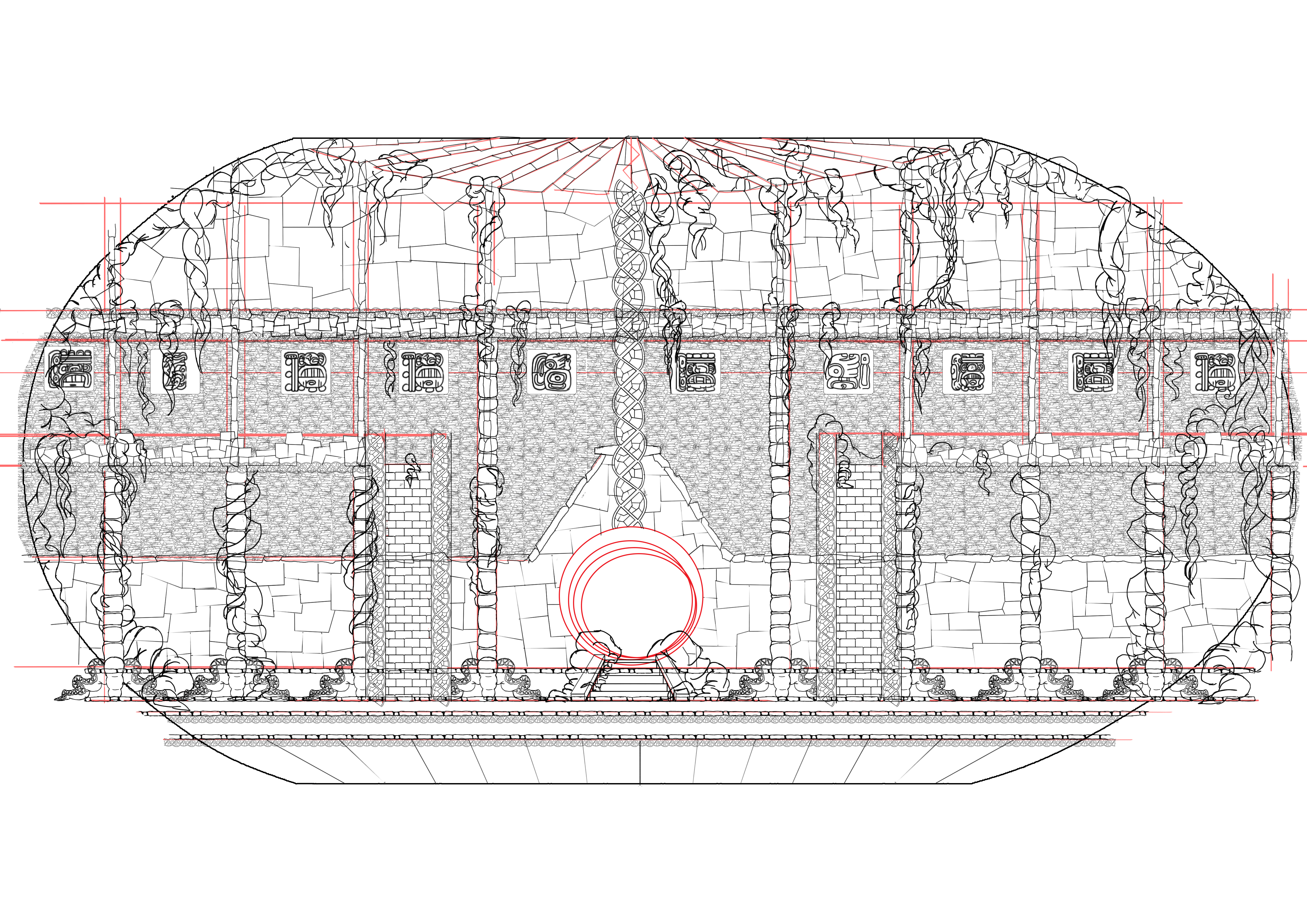
As I was starting to plot down some survey drawings the other day, it occurred to me that I have no idea what measurement unit to use for my technical drawings. It seems strange to use the metric or imperial system when my design’s destination is a virtual space. I know character designers often use the heads of their characters as measurement, but I don’t know how to do this without making it an effort for the prospective modeler. Since modeling software have measurement helplines within normal measurement systems it seems odd to create my own.

Also, I’d have to use the same character to create a consistency throughout the models. In my head it seems perfectly easy, but from a technical perspective I can imagine the trouble it might cause. In example, what if I save the character in the wrong size, and the model come back in the wrong size? I suppose this could always be altered, as it’s not a physical build, but it does seem like a whole lot of extra work that could easily be avoided.

On About.com, the question of which measurement to use is answered by the following:

The easiest answer is “any unit you want.” Because you’re working in a virtual space, there’s no need to define measurements by standard units; you wouldn’t really make a road that took up three miles of virtual space. Instead you’d make a road where every mile represented was just as long as 5,280 of that child’s toy, set end to end. What matters isn’t the specific measurement; what matters is relative scale.

Souce

And finishes with:

Work out whatever method fits your animation style and workflow best. Otherwise you may end up creating objects that are just far off enough in size to be jarring and ruin your animation, rather than fitting together seamlessly. It can be especially difficult to guess when you’re working with perspectives in a 2D or 2.5D space.

I suppose, for me, it would make more sense to use the metric or imperial system to a set scale, as this is something we’ve done throughout the past years of our course. Using one of my characters as the standard measurement would make perfect sense to me, and would be more convenient if her design changed, as the environment would follow her design. On the other hand, if I was handed a set of technical drawings and told to build it with a selected character as the measurement unit, I might get confused. Actually, to be honest I can’t imagine struggling to understand it, but using the metric or imperial system just seems like a safer bet.

Moodboards…

I was struggling a bit to get my moodboards for the exhibition down. Initially I wanted to use car tyres inspired by Tooting’s many car dealerships and design this in an infographic style. Then I got more inspired by Tooting’s flower stands, and wanted to use rollfilm as a theme.

Somewhat okay moodboard.

Somewhat okay moodboard.

Moodboard that failed...

Moodboard which failed…

I’m not super certain about what kind of colour palette or style I would want the exhibition to be in. I’m pretty sure I’d be fine with anything that’s not inspired by the 70’s. I like the retro TV style we were discussing, and the modernist, plain white style, but I don’t really have a preference yet.

What I am really keen on, is building a ferris wheel-like shelf for our white cardboard models. The models take up so much space, and although they’re very interesting for us to look at, they might not be eyecatchers for our audience. So I thought we could make something fun for them. The idea behind the concepts below was to have a spinning rollfilm reel, in the style of a ferris wheel. I thought we could make the base frame out of wood or metal, and cover it with hard plastic sheets (brain freeze, can’t remember the name!). Since the plastic sheets are a bit transparent, we could make the shelves as little boxes and put coloured lights inside of them. I think this could be a nice match to what some people were discussing to do with the television wall (also still under planning).

psd for ae animation copy psd for ae animation copy7 psd for ae animation copy6 psd for ae animation copy5 psd for ae animation copy4 psd for ae animation copy3 psd for ae animation copy2

The main source of inspiration came from the set build of Lumino City (video below). The ferris wheel really inspired me.