It’s been a while since I wrote in the exhibition journal now. Although the project is finished to some extent, I just wanted to add some final touches.
First off, the second year students did an absolutely amazing, brilliant, fantastic job on constructing the flats, the hub, the plinths, the everything! We carried the plinths to the studio a few weeks back, and they’re perfect! It was really nice being able to take some money out of the budget and reward them with pizza (not to mention feasting on the leftovers!).
Yesterday we had a session gluing boxes, which was nice. It was a good break from all the stress of finishing for the deadline, for some peculiar reason. Henrijs painted the boxes today, and I cannot believe how nice he made them look! I mean, seriously, they’re used KFC boxes, and he made them look like canvases!
Robin brought in all the pillows she made. Meg helped out with the build on the day she got back. I’m super excited to get started on exhibition stuff once we finish our assessments. It’s going to be a genuinely beautiful exhibition, and I have had such a great time being part of the development process. I can’t wait to see it all come together.
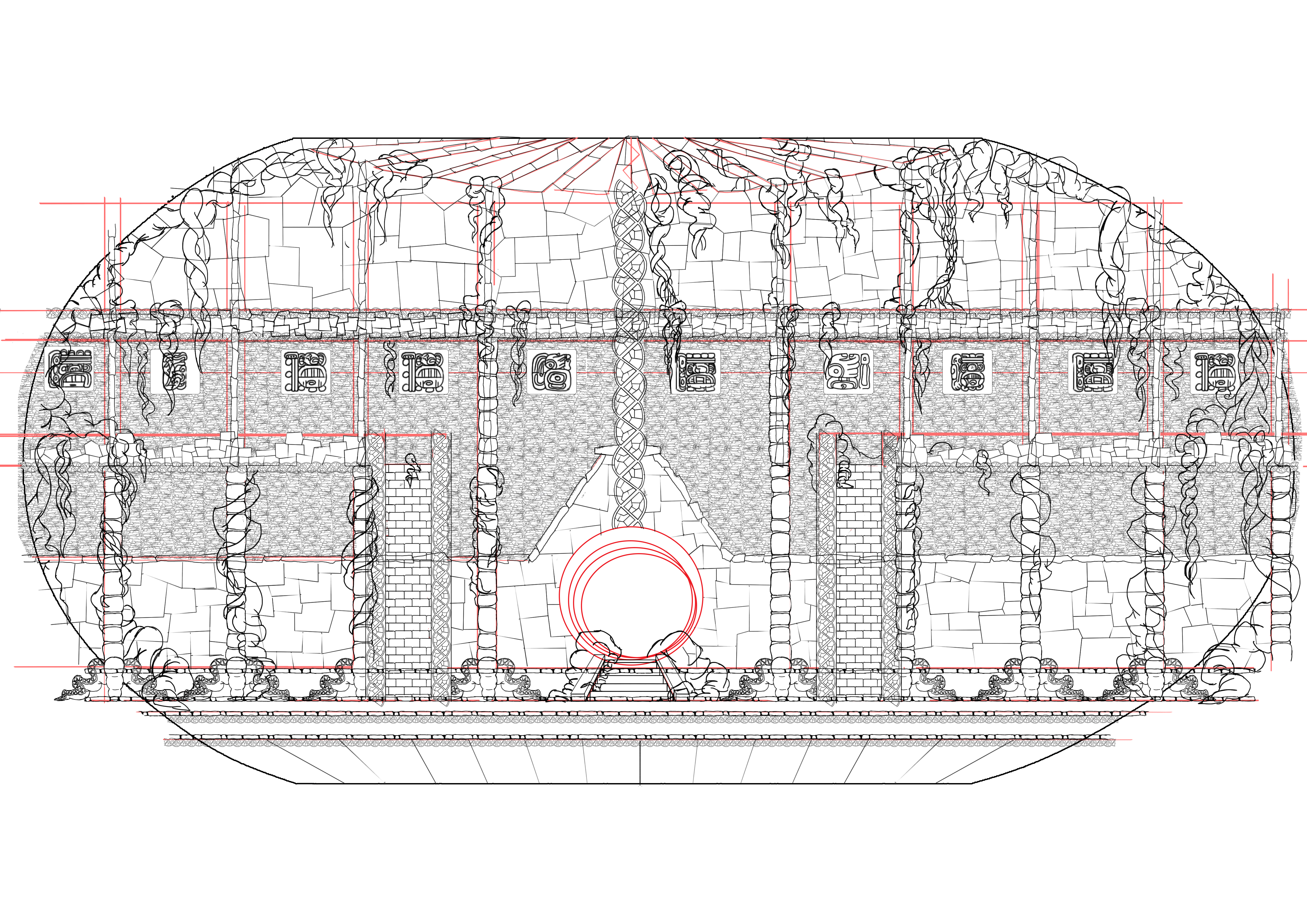
I was painting the interior design of my Mayan observatory the other day. I had the old layout design up as reference, and Charlotte told me it reminded her of Disney’s Atlantis. This made me very happy, for two very different reasons:
Atlantis was also based on the architectural style of ancient Mayan civilization.
This style has already been done in animation, many times I’m guessing. This is why I stepped away from this design: I didn’t want to create something strictly period based.
I’m thinking about the graphics for the observatory interior. These have to be few, and explain two versions of the prologue (excluding Shadow’s actions which hadn’t happened yet at the time the carvings were made).
It’s highly embarrassing to admit that it never occurred to me just how much artwork goes into creating a video game. I remember looking at the course description for NFTS’s Game Design and Development course a few months back, but I brushed the idea away when I saw the coding part. I don’t know why, but in my head it made sense that I would have to know about coding before even applying to the course. When reading the course description now, I don’t understand my previous way of thinking.
Anyway, I went to an open day, and it was amazing. I was actually there to check out the DIgital Effects MA, because I wanted to find a way to tell stories digitally. The two open days were merged together. As I was listening to the pathway leader from Digital Effects talk about the course, I was having second thoughts. The course seemed absolutely amazing in its structure and content, but to me, it felt a bit like I wouldn’t be able to create stories myself (not that I would mind working on someone else’s concepts). The fact that I was imagining the type of projects I could do outside of uni to balance it out, in itself, suggested that the course was not for me.
Then the pathway leader for Game Design and Development began his course description. My jaw, quite literally, dropped. Animation, storytelling, digital modelling, and coding. Not just coding. I used to like making html websites in High School, but I don’t remember anything from that now. I made an app earlier this academic year as a sample for the exhibition project. It was bad, but I enjoyed making it. So, I realized, even though coding seems intimidating, it’s just because it’s new. It’s like learning technical drawings in order to design a set for live action. Now, I’m desperate to learn it!
Basically, this course has a little bit of each of the different courses I’ve been looking at this year. It seems custom made to my every wanting and need, haha! So yes, I am definitely applying.
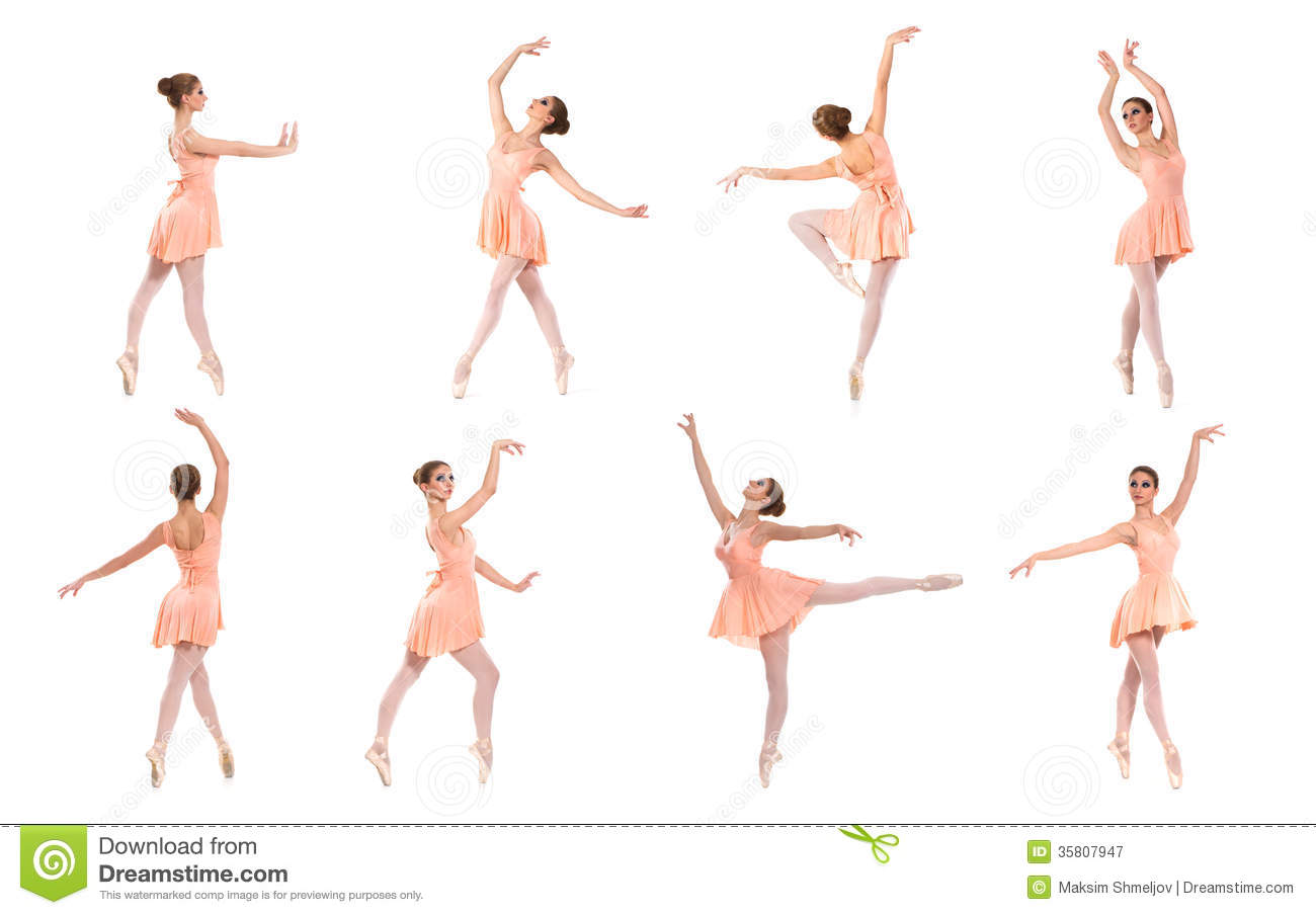
I am officially struggling with my storyboards. I have this scene where Plant, the Lonely Monster, helps Lumi stand up. He reaches down a branch, pulls her up, and swings her around like a ballerina. The problem is, a swinging ballerina is frickin’ difficult to draw! At least for me, haha…
I’m using the references below, but it’s taking quite some time to understand how these poses work. Maybe I’ll try acting them out (though my body might break from that).
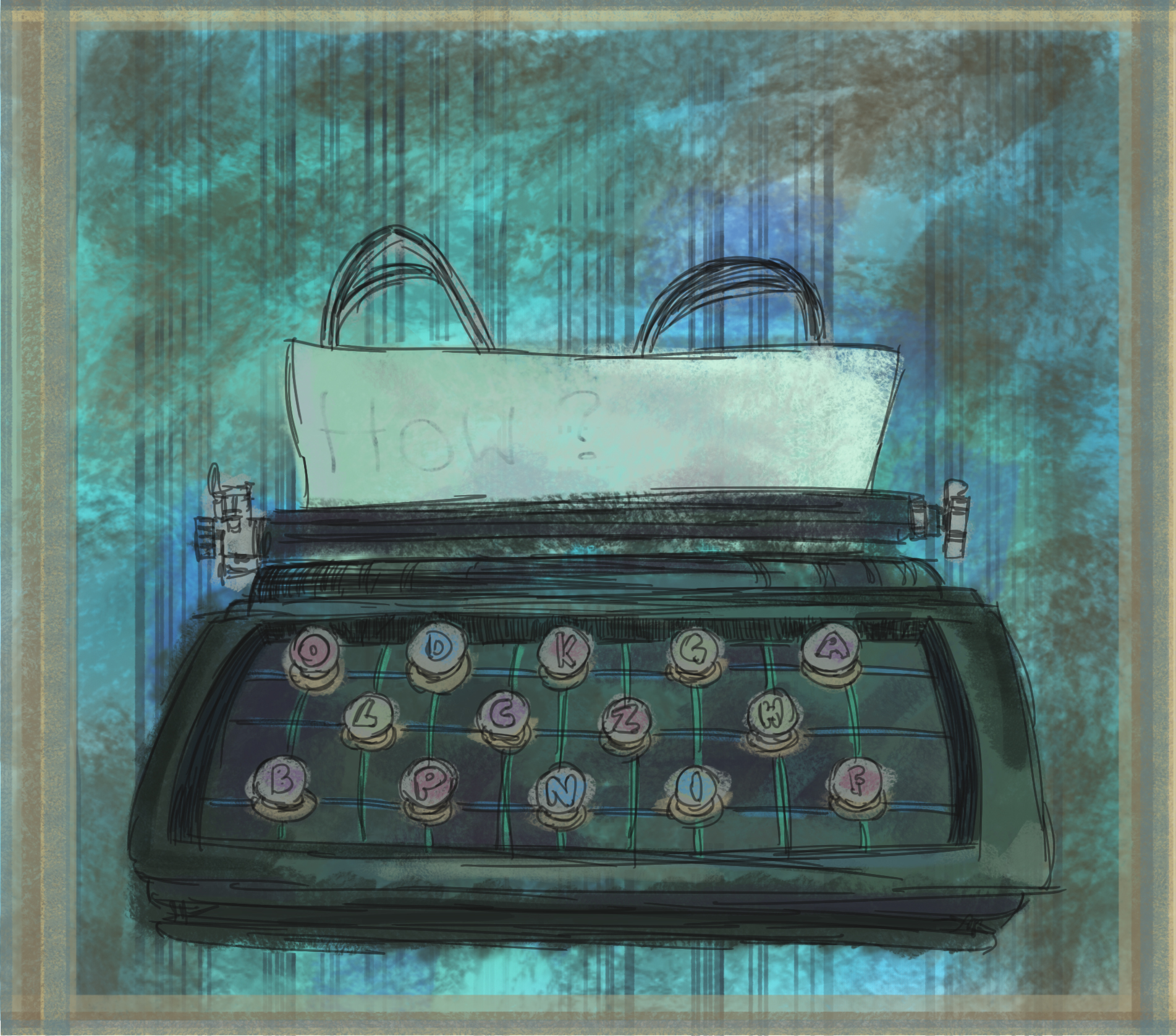
I went up to WImbledon Village this morning to get a change of scenery. I wanted to fix up my script a little (a lot), but it was too hard to focus at home. So I sat down at a coffee shop. As always, Twitter opened up as my start page. I wanted a picture of a typewriter for a tweet, so I googled typewriters, and discovered Michael Mullan’s work (first image below).
Vintage Typewriter. By Michael Mullan. Check out his website –here-.
I was really inspired by Mullan’s illustration. When I got back home, I noticed my own typewriter sort of calling out for me. “Draw me, draw meeee…” And I didn’t want to be rude, so I kicked open Photoshop and made myself a little sketch. It’s not my finest work, but it was a nice inspirational kickstart. I’ll leave the “how?” up for interpretation. It’s pretty simple to figure out.
Original drawing. The paper looked a bit too out of place with nothing on it, so I added the “How?”.
Here’s just a little experiment with a different background.
While listening to The Bancroft Brothers’ Animation Podcast, I came across the existence of a pitch-book: a book to collect ideas for future projects/pitches. I made one. It’s the most fun thing I’ve done all year, I simply went through my notebooks and added my ideas into one place. In fear of anyone snatching my (obviously genius) ideas [feel like I should add a genuine sarcasm in brackets so I don’t receive hate mail], I won’t post the ideas, but here are some sketches from one of them:
But in all seriousness, the pitch book is actually a really good practice for developing concepts. And, it’s good for just keeping track of my thoughts 🙂
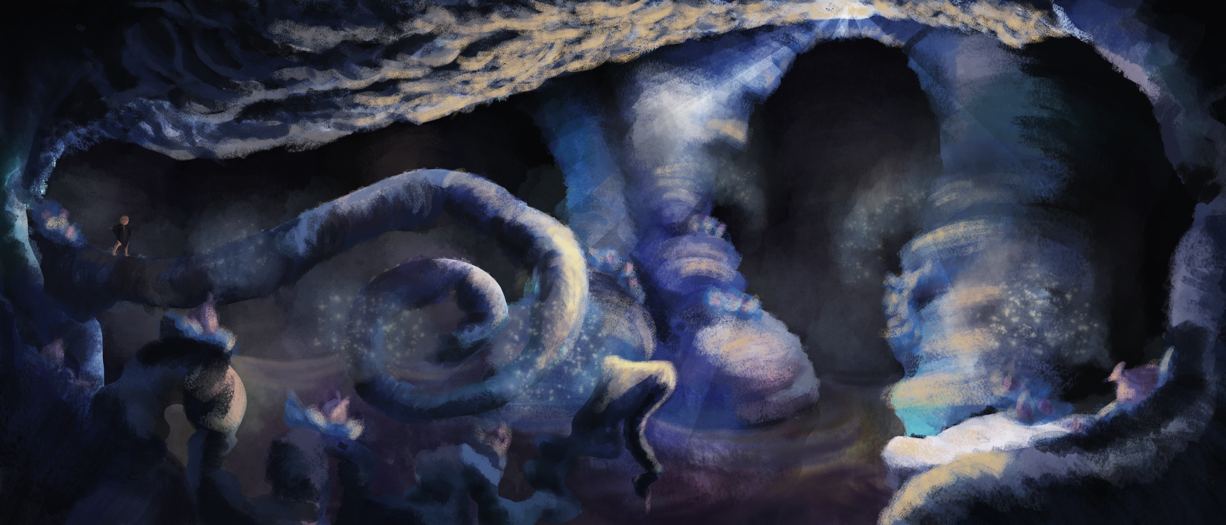
After my procrastination post yesterday morning, I decided to spend the day creating a matte painting for a contest I wanted to enter.
By Benita Kvinlaug. All rights reserved.
A few days ago now, I’d watched a Lynda.com tutorial by Daniel Lieske, on how to create a digital matte painting in Photoshop. I knew I wanted to work with the design above, but I was very lost on how to decide on the colour palette. I wanted to use the contrast of blue and orange, with the side contrast of purple and yellow. However, each time I’ve tried to colour this design, the image ends up looking far too saturated.
The obvious solution is to de-saturate my colours, but whenever I tried this, my image would look dull and almost monochromatic. After searching youtube for a bit, the tutorial below showed up in my recommendations:
The tutor, Sycra Yasin, gave a lot of freebies from his website, including a free trial of his Photoshop colour wheel plugin, Coolorus (which by the way, is absolutely worth getting!). This tutorial was an eye-opener, and provided me with a much deeper understanding of colour theory.
So, I used Yasin’s colour wheel and tips to put together my colour palette. It took a couple of tries to get it right, but I’m very happy with it now.
Colour wheel and tear template can be downloaded for free at Sycra.net.
(Colour chart above:) The idea of the tear drop, is that it creates a restricting mask over the area of the colour wheel. In order for your colours to collaborate, you need to only use these colours. Theoretically, you can give 100 per cent saturation of your main colour (blue, in my case), and 25 per cent saturation of its complimentary colour. The closer a colour is to your main colour, the more saturation you can give to it. In example, purple might get 75-80 per cent.
The only colour I cheated a bit on was the bright yellow, which I actually gave quite a high saturation. I felt this was necessary to light my design.
Final painting
I began by painting random colours onto a background layer. I then used the lasso tool to create basic shapes, copy-pasted them into new layers, and used the burn and dodge tools to give a basic indication of a light source.
I made some few adjustments to one of Photoshop’s stock brushes, and painted in the background layers using my new colour palette.
Repeated the same for the other layers.
A somewhat finished painting, but I felt like I needed a character in here to give an indication of scale.
Character added to the screen left area to give an indication of scale.
Colour test: I tried increasing the brightness and contrast, but didn’t like the high saturation of blues that this created.
I tried changing the exposure. I liked how this looked, but it didn’t communicate the idea of a dark forest…
Thus, I went back to the original image and played around with the light some more.
I used the curve window to alter the levels.
I sent some samples to a friend, got some feedback, and made the shaded area a bit darker.
Final image.
That’s it! I sent in my submission, I learned a lot of stuff, and I crossed something off from my list!