Something that I’ve been struggling a lot with for this project, is the island in which my whole story takes place on/around. This is an issue, as the island is vital to the story. My problem is: what shape should it be?
I originally wanted it to appear fairly plain from a distance. Then I decided that that seemed boring, and would likely not communicate the island’s sinister and dead reputation.
-

-
Reference for how to show a lonely island.
-

-

-
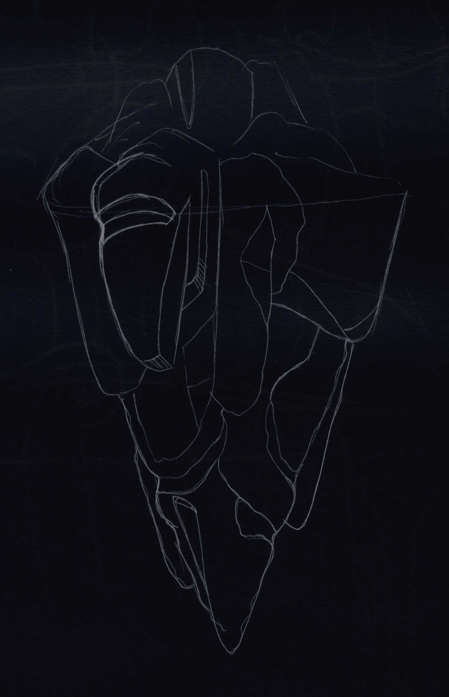
Ancient star chart used for plan reference.
-

-
I considered a floating island for a bit, but this did not function well with the metaphor of having ‘more under the surface’.
-

-
Star chart for inspiration.
-

-

-
An island with ‘more than what you see on the surface’, which collaborates with my story’s theme.
-

-
Background reference
-

-
I love how the island’s textures transform visually when seen through the water.
-

-
Atmospheric reference.
-

-
Plain island which has visual existence under the water surface.
I remembered reading Arnold Aronsen’s American Set Design book a few years back. This book features a visual library of different theatre designs, with the designers’ notes in addition. Something from this book has stuck with me since reading it: one of the designers specified that he would always work out his plan first. Then, and only then, could he achieve a functional and appealing design.
Since I’m more of a technical than a creative person, I was really fond of this idea. I think I’m one of those people who has to see the lines before I can draw outside of them. Anyways, yesterday I returned to one of my island visuals which I haven’t worked on for a while, but as I saw it, I realized how very, brutally bad the design was. It looked okay as an illustration, plus the hours and hours I’d spent perfecting it were difficult to discard from this moment of truth, but eventually I had to admit to my island’s current, dysfunctional design.
I sat down at home trying to figure out the plan. One thing I decided early on was to have the island round, so that it would look like an eyeball. I imagined the sand around it or the levels under the water surface could be the eyelids. I also had this ‘grand’ idea of having the island appear plain, until the moon rose to a position that would visually look like it was the pupil and the island was the eye. I still wanted these elements, but they were proving trickier to get.
One more thing I was struggling with, was working with a big-scale location. Since all my other locations exist inside of this island, its plan has to allow for the characters’ paths. I asked myself: what are the most important aspects of the island’s plan? Answers:
- Lumi has to discover The Lonely Monster in the very center of the island, because this symbolizes that the monster is the island.
- The girls have to wake up stranded on a beach/location which is situated as a line between the dark forest and the endless horizon. Both have to be clear, close, and grande.
- The observatory has to be close to water, but cannot be visible to the characters during the first scene when they notice the island, as it is supposed to be a discovery in Act 2.
Ideally I’d want the observatory to be on a beach as well, as I want the effect of the moon shining through it’s cracks to create spotlights on the water. I also want it to be the tallest point of the island: it would make sense to build an observatory on the tallest point of the island. But this collides with how I want The Lonely Monster to have build a massive shield of branches which covers the entire island, as the tip of the shield would then be the tallest point.
I sought help from one of my flatmates, who’s currently in Theatre Design. She started telling me about ‘her rock in Greece’ as she called it: a rock that her and her siblings would swim back and forth to from the beach. I was fascinated by this, and realized that I had not considered the possibility of rocks around the island. Except pebbles, but those generally don’t stretch very high. I was even more fascinated when she drew it up for me, and it looked like a tall, constructed pillar sticking out of the water, far away from other land. I looked into some images of Greek island, particularly Patmos, which is the one with my friend’s rock:
-

-
Larger rock dipping out of the surface.
-

-
Solid land seen from afar.
-

-
Interesting way of framing the beach.
-

-
Extremely cool, swaying mountain structure.
-

-
Rocks dipping up from the water. Greek island beach.
We started talking about how I could show the island. This conversation was mind-opening, and totally jump-started my inspiration and motivation back on track. We drew some collaborative sketches working out what it could look like. We came up with the following:
- The observatory could be on a rock outside of the island, yet it would still have to be connected, and there would have to be a way for the characters to get over there.
- Since the island is supposed to show traces of an ancient civilization, and The Lonely Monster is supposed to be shown as the one who ‘held up’ their society, the monster’s branches could have formed a bridge which led to the observatory. Since the island is decaying, the branches can be dipping into water, like a broken rope bridge. Thinner branches could still be hanging over the water, offering an alternative, more challenging route for the characters to get across.
For technical drawings, I’m referring to the visual development process of Tangled (2010, dir. Nathan Greno & Byron Howard). Maybe this will help me in comprehending the larger location.
-

-
Tangled production art: Island layout.
-

-
Island in colour, 3D view.
-

-
A portion of the island is cut out to show more specific areas of action.
-

-
Portion of the island is cut out to show more specific location.
New moodboard for island:
-

-
Natural colours.
-

-
Blue tones.
-

-
Blue and orange tones.