After experimenting with my concept drawings, and settling with a color palette I quite liked, I decided to put together some moodboards. The palette I had in mind was a subtle violet, with a strong contrast between light and dark values.
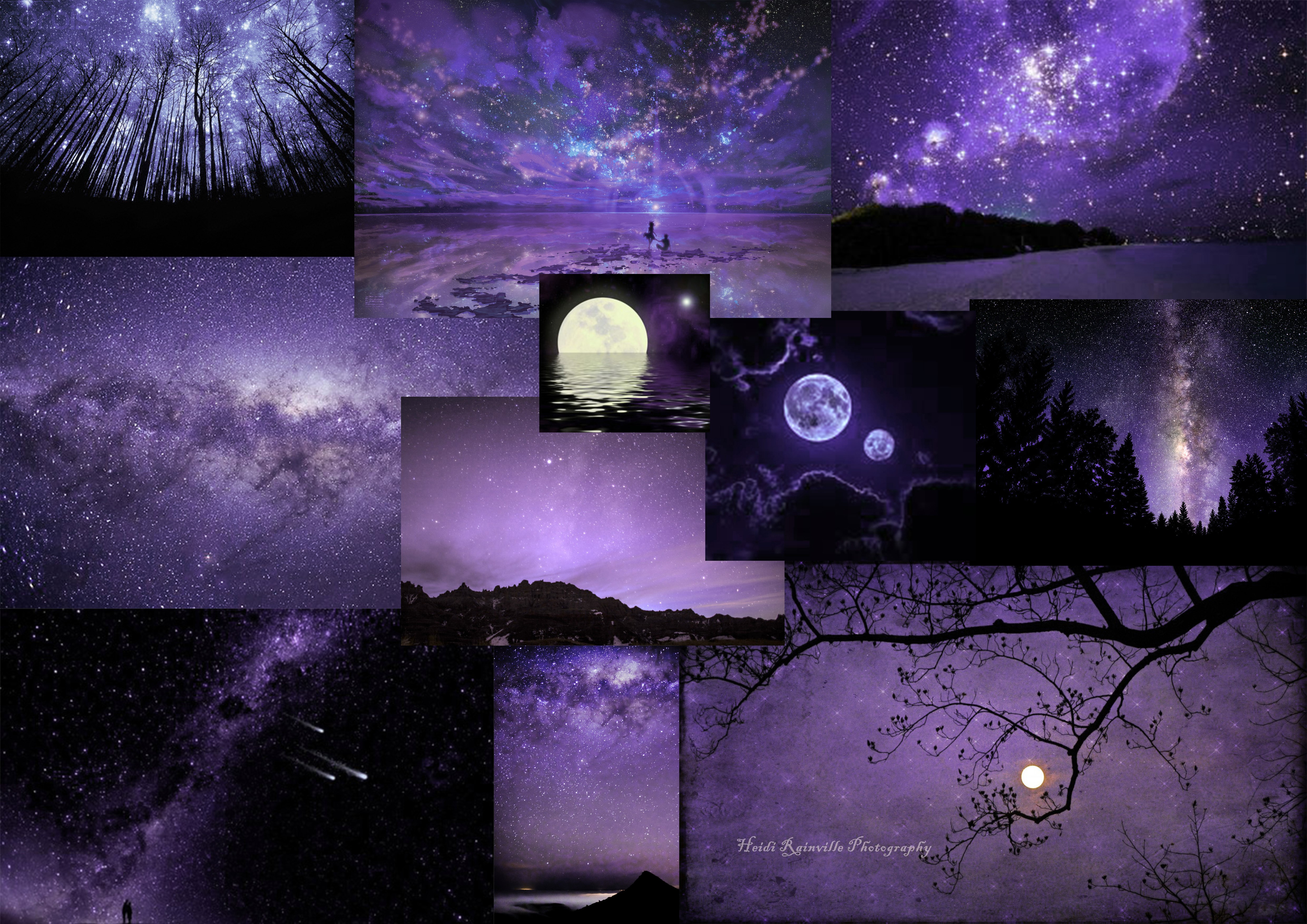
Moodboard: purple color palette.

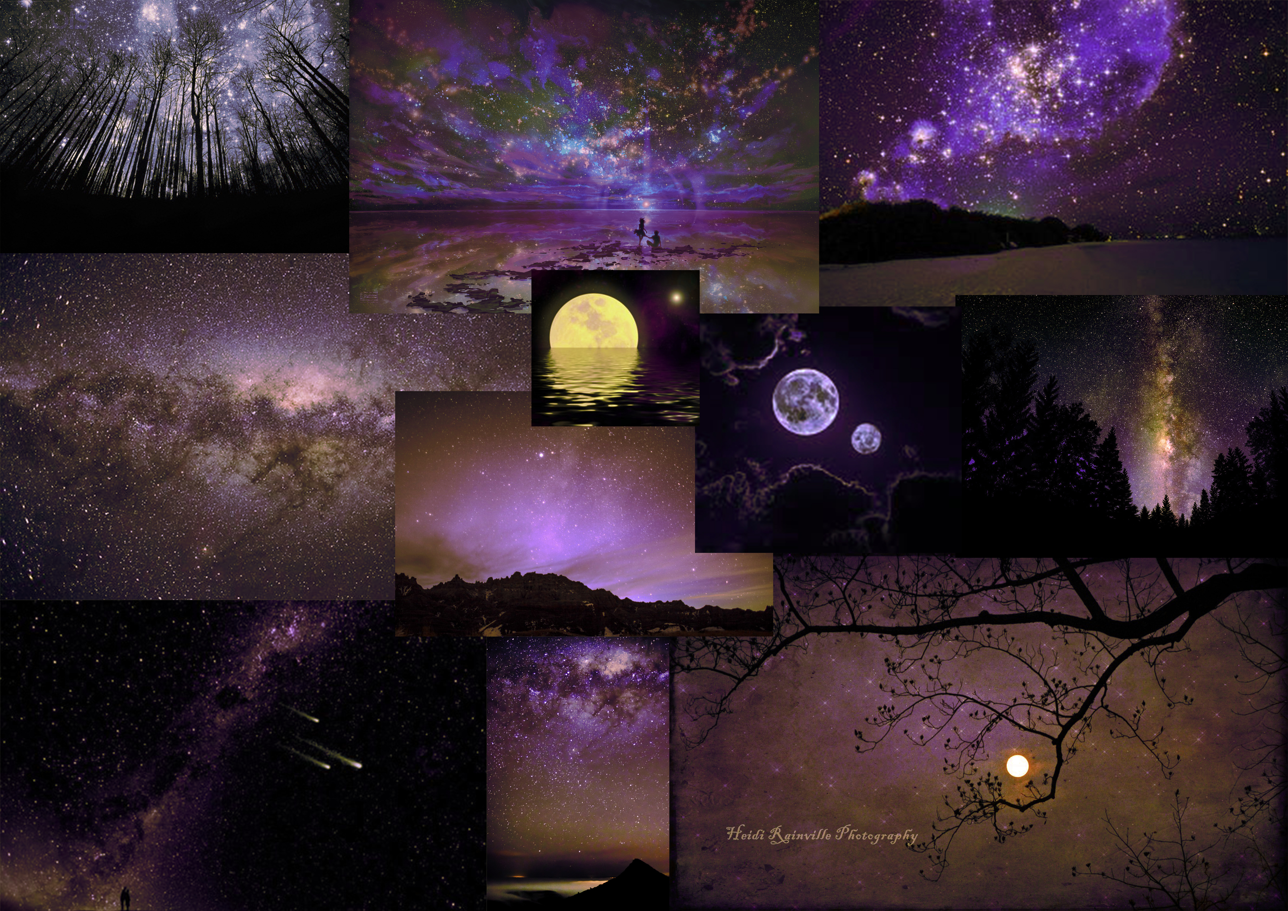
Moodboard: purple and blue palette.
As I was creating these boards, I realized that no matter how much contrast there is between light and dark shades, a palette without color contrast will naturally appear monotone.
Moodboard: purple and yellow color palette.
I tried adding yellow to the purple, but this reminded me of too many films I’ve already seen. Tangled (2010) especially.
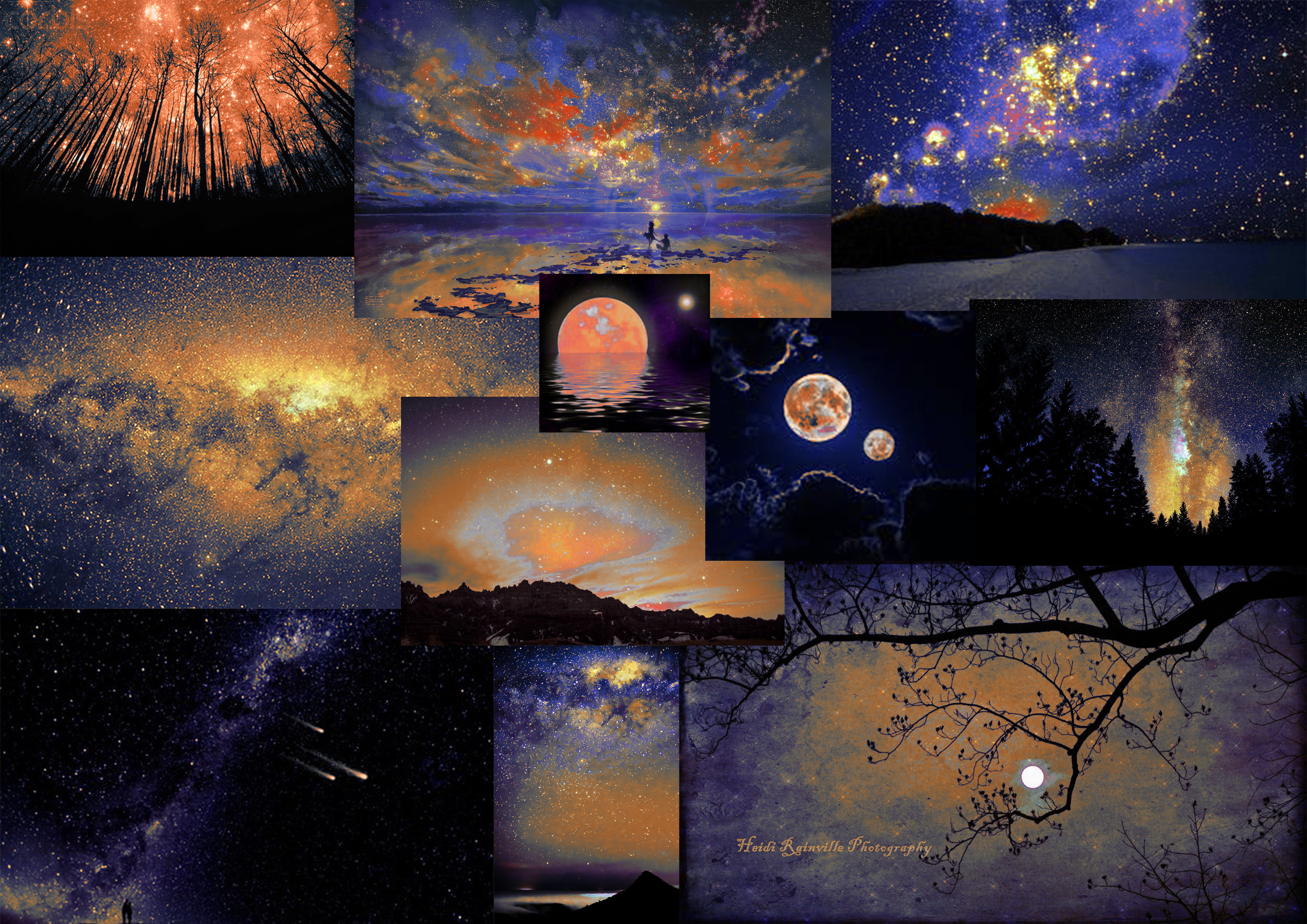
Moodboard: blue and orange contrast. Winner!
However, when I went back to the original contrast I’d had in my concepts, it looked really nice! The colors on these boards are a tad too vibrant and strong, but I think the extreme makes a good impression. I can tone it down now instead of trying to enhance it.
I feel like I’m often trying to make things too naturalistic. A purple and yellow colour contrast is more comfortable because it seems more similar to natural occurrences. But I want to challenge myself to work with something outside my comfort zone. I really like the contrast between blue and orange, and I like that it sends out a more surreal essence.
